Tuesday, October 9, 2007

Assignment 7 : Website Review


Website critique::

Figure and Ground::
Figure and background is visually competing with each other.
Dominant and subdominant element; However not much visual contrast.
An attempt to create visual hierarchy; However text and visuals clutter the interface.

Size::
The size of the text and graphics are not played intuitively and no visual contrast.

Contrast::
Bad contrast between background and foreground.

Details::
Navigational details are everywhere, and clutters the entire interface.

Proximity:
The text and graphics are of close proximity to one another, making it difficult to organize the information visually.


Proposed Improvements::
  • Proximity of text and graphics
  • Organize the elements visually
  • Introduce more spatial values
  • Size of text for links
  • Interact better with background
  • Introduce icons for links
  • Visual contrast between background and webpage
  • Alignment

Monday, October 8, 2007

Assignment 5 : Urban Fauna : Laptop Skin Design


URBAN FAUNA.
The concept of the design skin draws its framework from the idea of urban living amidst the rich growth of flora and fauna. Instead of introducing trees amidst the highly structured urban landscape, the urban is concretised amidst the random growth of flora and fauna. In this context, leaves veins that crawl on the cityscape become highways where vehicles travel and lamp posts stand. The bird sits proudly outside the cage which has lost its bars. This sight is symbolic of the new gained freedom of wild life. This design aims to draft a different world view for its audience, and reaches for another extreme as it carefully forms a separate new whole environment.

Monday, October 1, 2007

Assignment 3 : Photo Journal : Story of Teddy


Assignment 4 : Earth Project : Poster


Thought Process.
In designing for the poster, I thought about the visual hierarchy. The line work of the bulldozer indicates the light emphasis of the visual element. The straight rigid lines of the bulldozer contrast with the curvatures of the flora and fauna which takes its position in the centre of the poster. They are rendered contrastingly in gradients. The color graduation highlights and marks the focal point of the poster - the symbolic element of the Earth. The visual indicates the beginning of LIFE on earth, which is planted by the bulldozer. The color and unpredictable curves and shapes contrasts from the stark and structures lines of the bulldozer - draws parallelism to how Earth is awaken by the very existence of greens and colors of plants.

Assignment 2 : Making Images Talk

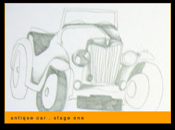
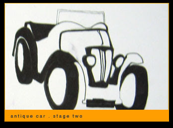
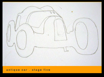
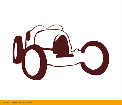
In this assignment, we are required to choose an object and create a symbolic or indexic representation of the object. I have chosen to do an iconic representation of the object.

Concept.Thought Process.
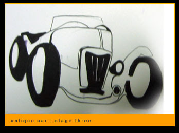
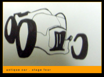
The antique car is a 3 dimensional object, comprising of highlights and shadows, and even the details that gives finishings that defines the form of the car. In this project, it compels me to go through the process of abstraction, by reducing the many tones of greys and colors to only one single color, and eliminating the many details to a two tone work. Nevertheless, the audience still retains the concept of the object and grasp clearly and thus draw parallelism to the actual object. Line works and unique shapes are used to sculpt the space to form graphical representation of the object. The positive space interplays with the negative space to convey the complexity of the 3D object. Though the elements of the icon is minimal, I attempt not to lose the essence of the object, and making every graphical element that makes the car recognisable and unique of its form and shape.

Critique.
One of the classmates during session suggested the graphic to be indexic. Probably to eliminate even the back wheels, only to retain the front facade of the antique. It was probably enough to convey sufficiently the concept of the antique car.